The Tinder Theory of Web Design
When it comes to web design, first impressions are very important. In our increasingly digital world where people make decisions about what they see online in 1/50th of a second, good web design is key to nailing that first impression fast. In a world where Tinder is one of the most popular dating sites, looks do matter – a lot.
Someone told me the other day that when it comes to your website, you have three clicks to make a first impression. If someone can’t find the information they’re looking for in three clicks, they’re moving on.
First impressions are just as important online as they are in real life. Maybe even more important.
A recent article in Forbes noted that “Google’s famous first impression study found that a user judges the beauty of a website in 1/50th of a second. In that time, users rate visually complex websites as less beautiful.” When it comes to web design, looks aren’t everything, but they matter a lot.
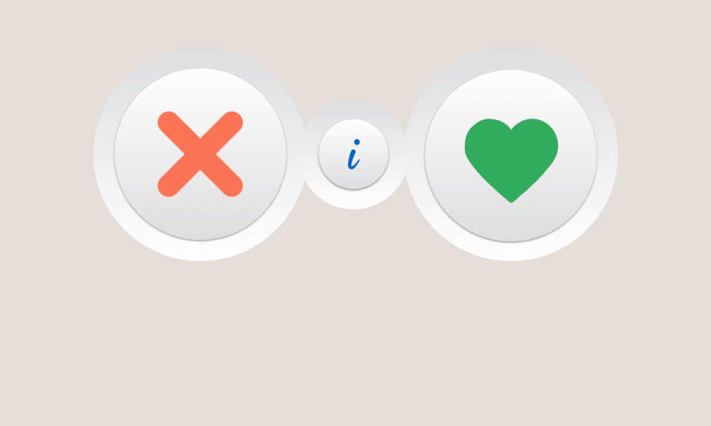
Take Tinder for example. It has become one of the world’s most popular ways to find “love” online, and is also one of the most cutthroat. On Tinder, you have a few photos and a few words to present yourself to someone who within a few seconds is going to decide whether they would want to connect with you. Then you just swipe right if you like what you see, or left to kick the person to the curb. Sounds harsh, and probably shallow, but it’s true. And brilliant.
Thanks to the internet, most humans have developed attention spans that are only slightly longer than that of goldfish. The creators of Tinder capitalized on this by creating a dating app that doesn’t require users to focus on any one thing for more than a few seconds.
With the human brain forming opinions at the speed of light, you need good web design to make sure that your company’s website is positioned to nail that first impression. Nobody wants to have to click through vague links or read through reams of copy to get the information they’re looking for.
Let’s say you’re an order-based business that requires customers to contact you. But thanks to poor web design, the link to do so is way at the bottom of the main page, or you don’t have a contact form, or your phone number is buried among vague links. Your website starts to feel like that guy or girl who only posts photos of themselves with friends, so you don’t know which one he or she is and have to search through the clutter of people to figure out who the profile belongs to.
Swipe left.
Remember, your website is an extension of your business and of your brand. And just like on Tinder, you only have a few seconds to make a good first impression. Are you presenting your business in a way that makes customers want to swipe right?
